

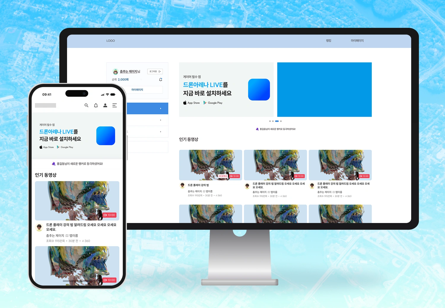
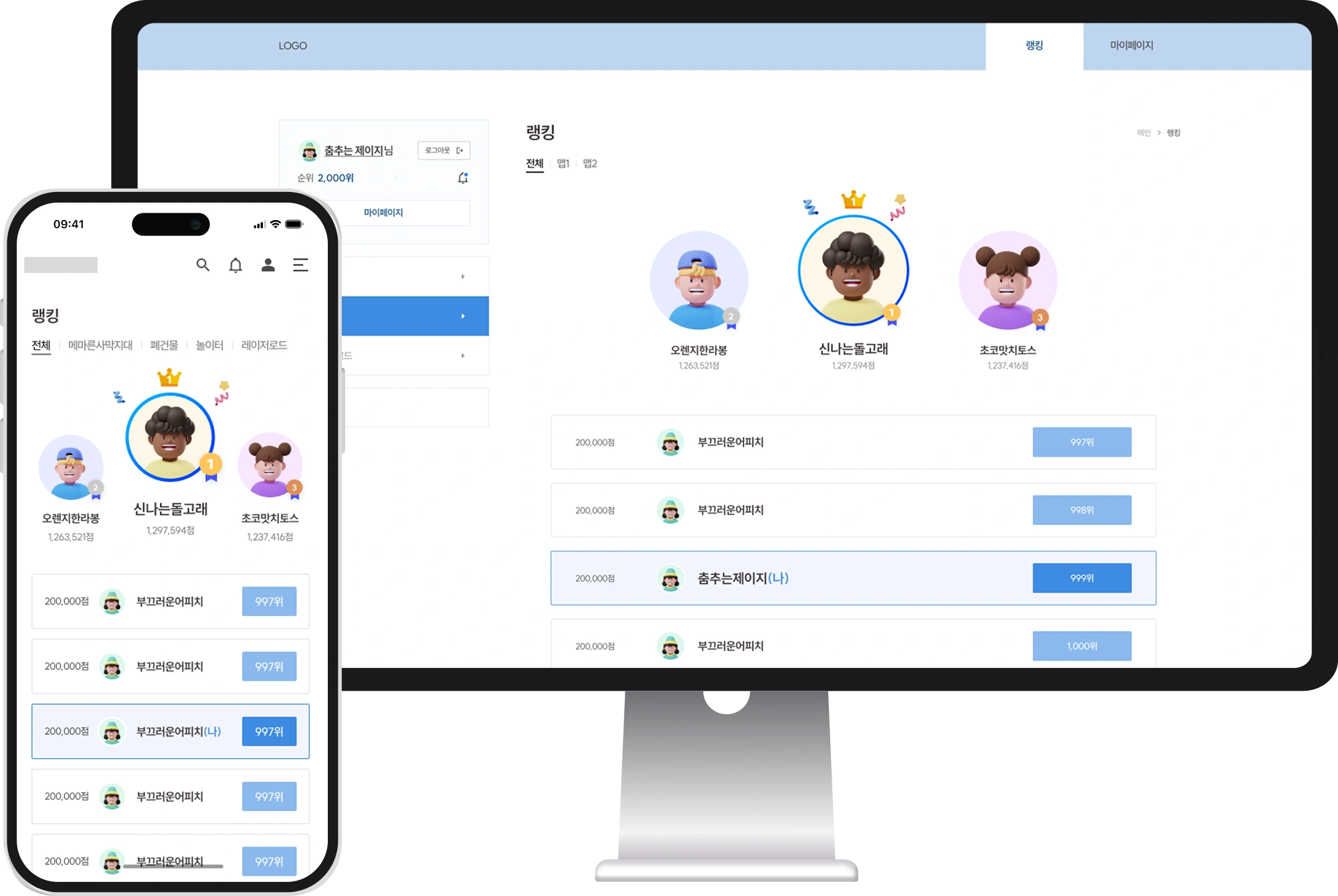
This project focused on reorganizing and improving the UI composition and publishing structure of the existing Drone Arena website. The primary goal was to unify inconsistencies between desktop and mobile screens, strengthen design consistency, and improve responsive behavior.
Rather than full system development or feature expansion, the work centered on restructuring page layouts and increasing overall visual quality while keeping the existing design direction intact.
The client requested improvements to UI consistency and overall visual quality. The existing website had inconsistent UI structures across pages, which reduced visual coherence for users. Even when content was the same, spacing, layout, and alignment differed between desktop and mobile, lowering perceived service quality and brand trust. The client needed a unified set of UI standards and enhancements to visual completeness.
They also requested refactoring of publishing code and improvements to the responsive structure. Duplicate CSS and unnecessary style declarations made maintenance difficult and caused layout inconsistency across resolutions. Display issues were also reported on certain browsers and mobile devices, requiring quality improvements through cross-browser support and responsive restructuring.
Finally, the client asked to preserve the intent of the existing design rather than applying a full redesign. They requested refinement of detailed spacing, alignment, typography, and color systems to improve balance and completeness across pages, positioning the work as a visual quality improvement rather than a structural renewal.
We unified the UI structure and improved visual consistency by redefining common components such as headers, footers, buttons, and input forms under a consistent design system. Spacing, alignment, and typography ratios were adjusted to establish a cohesive visual rhythm, and redundant or unnecessary visual elements were removed to improve content focus.
We also cleaned up publishing code and strengthened responsive behavior by correcting UI mismatches between desktop and mobile to deliver a consistent UX. HTML/CSS structures were optimized to improve maintainability and readability, and a responsive layout using media queries was applied to better support a wide range of devices.
In addition, we reorganized and documented a design-system-based component approach, managing common UI elements such as buttons, cards, and input forms at the component level. A style guide was produced to maintain consistency in future design and development collaboration, including alignment rules, color systems, and typography standards.
As a result, brand consistency and overall visual quality improved through UI refinement alone. Mobile accessibility and usability were strengthened to improve user satisfaction, and improved maintainability supported greater operational efficiency going forward.


